2014 Household Travel Survey: Public Release #2!
filed under:
We’re happy to announce that the newest version of the 2014 Regional Travel Survey is now available for download! We’ve spent the past few weeks identifying erroneous trip reporting and making a few improvements to the data originally released in Public Release 1 in December 2014. In this post, we’ll present a few summaries and discuss some of the nuances of the results. A follow-up blog post in a few days will discuss what’s changed since the first release and some technical details on how and why we made these improvements. To read more about the changes and download the data directly, visit the PSRC webpage here.
Survey Summaries
With the latest release, we’re able to speak more confidently about trip characteristics from the survey. That allows us to dig into the fun analyses like mode splits and trip length distribution. Regional mode shares are shown below for all trips, compared to PSRC’s 2006 Household Travel Survey for reference. Note that two weights (basic and GPS) are provided for 2006 and explained below.
Regional Mode Shares
| Trip Mode | 2006 Survey (Basic Weight) | 2006 Survey (GPS Weight) | 2014 Survey |
|---|---|---|---|
| SOV | 43.1% | 42.4% | 43.1% |
| HOV 2 | 39.3% | 40.4% | 37.2% |
| Vanpool | 1.3% | 1.3% | 0.3% |
| Transit | 4.2% | 3.5% | 4.9% |
| Walk | 7.8% | 8.6% | 10.0% |
| Bicycle | 0.9% | 0.9% | 1.3% |
| Other | 3.4% | 2.9% | 3.2% |
It isn’t always straightforward to compare two separate surveys, so the 2014 data is contrasted to two different result sets from the 2006 data: mode shares with “basic” weights and mode shares with “GPS-corrected” weights. The basic weights represent sample mode shares, expanded to the regional population using Census-based weighting factors. The GPS weighted results represent a weight correction created from a 2006 GPS-based survey conducted at that same time. The GPS survey compared reported trip details to GPS-recorded details to create a correction factor, which reduced the number of under-reported trips and increased trip lengths, particularly for walk trips. We will be conducting a similar GPS-based survey this spring, and will use the results to apply a similar weight to 2014 results.
The GPS-corrected weights are likely to change 2014 walk share, but perhaps not as much as seen in the 2006 survey. We tend to think that our latest survey technique has actually captured many more walk trips than previous surveys, and thus less dramatic changes will be seen.
We do not necessarily believe that walk share has increased as much between 2006 and 2014 as is shown above, but rather that we’re doing a much better job of capturing all walk trips than we were in previous surveys. The 2014 survey was PSRC’s first web-based survey, where users were repeatedly prompted to remember any trip they took that day, no matter how short. (We even got a few people reporting trips to their mailboxes and recycling bins…) Respondents were able to walk through their trip diaries in a much more interactive manner than before, verifying their destinations on a webmap, and were perhaps more likely to remember smaller details about their travel day. Many records from previous surveys like the 2006 survey were collected over the phone, where respondents may have had a harder time remembering and visualizing their trip history.
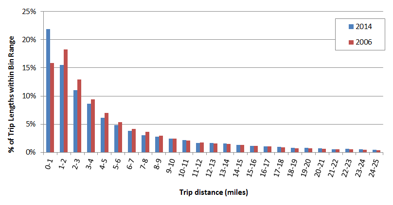
As I think back on my travel behavior this week, it’s easy to forget the quick trip I took across the street to buy a croissant, or the 10-minute stroll to get some fresh air. I’m thinking more about how many times I rode the bus to work, drove to the grocery store, or biked to a friend’s house. It’s easy to forget about those short little walk trips in the middle of the day. Maybe I would remember it better if I were prompted about it, and got to look at my travel day on a map. But it’s not just subjective speculation that we makes us think that our web-based surveys are picking up more walking trips. It shows up in the data too. Below is a weighted trip length distribution for all trips in the 2006 and 2014 data.
|
The trip length distribution in the 2014 (blue bars) suggests a higher concentration of short trips (less than a mile) compared to 2006 survey results (red bars). |
The 2006 data is very typical of trip length distribution plots for traditional survey results. Most trips are between 1 and 2 miles in distance, followed by trips less than a mile. Frequency decreases steadily for trips over 2 miles. For the 2014 data though, the trend is more consistent – trip frequency decreases continuously with distance. Most trips (almost a quarter) are less than a mile. We think this result might be because we’re capturing more of these shorter-distance trips, and we plan to investigate this more.
Speaking of walk trips, let’s now compare different regional growth centers to see where more walk trips are occuring. The table below shows the mode shares for all trips with a destination within a Regional Growth Center.
Mode Share for Trips to Regional Centers
| Trip Mode | Bellevue | Everett | Lynnwood | Redmond Downtown | Seattle Downtown | Seattle Capitol Hill | Region |
|---|---|---|---|---|---|---|---|
| SOV | 50.2% | 42.4% | 49.5% | 42.5% | 16.4% | 23.4% | 43.1% |
| HOV(2+) | 19.8% | 27.5% | 41.3% | 42.0% | 14.4% | 14.3% | 37.5% |
| Transit | 9.5% | 8.5% | 2.4% | 3.3% | 27.4% | 16.8% | 4.9% |
| Walk | 18.0% | 20.0% | 3.5% | 9.7% | 38.3% | 40.8% | 10.0% |
| Bicycle | — | — | — | — | 2.9% | 3.0% | 1.3% |
| Other | 2.5% | 1.6% | 3.3% | 2.7% | 0.6% | 1.7% | 3.2% |
These results show interesting variation across the region for all modes. Unfortunately, only some of the larger growth centers can be shown due to sample size limitations, but it’s clear that many of the currently-developed growth centers report many more walk, transit, and bike shares than the regional average. Even across the growth centers, there is significant variation in walk shares. Bellevue and Everett downtowns, for instance, attract 20% or fewer walk shares, while the walk share is double that in Seattle’s downtown and Capitol Hill.
This is just a brief look into the data. Over the coming weeks and months, we’ll be busy processing many more summaries and we hope you do too! Remember, the data is available in a spreadsheet format at PSRC’s main website here. Look for more survey-related posts in the near future as we really start digging in, and as always, please contact us directly with questions or leave us a comment below.