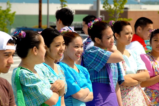
The Diversity of Asian and Pacific Islander Experiences
Across Heritages and Where People Live
And the challenges but importance of racial equity data
The Puget Sound Region has about 600,000 people who identify as Asian Alone and more than 35,000 people who identify as Native Hawaiian and Pacific Islander Alone, as we discovered last year during Asian American and Pacific Islander heritage month. Asian, Native Hawaiian, and Pacific Islander groups represent a wide variety of many different heritages in the region.
This year for Asian American and Pacific Islander month we wanted to dive deeper to learn more about the how Asian and Pacific Islander experiences vary across different groups based on their heritage and where they live in our region. This analysis results from a top agency priority of advancing racial equity.
Aggregate Census data can tell one story about people’s experiences, but underneath that lies a wide variety of individual experiences. Broad data about race and ethnicity can at times hide how different people really experience the world.
While writing this post, I learned that Native Hawaiian and Pacific Islander people experience significantly more disadvantages than some Asian groups. For future analyses, I plan to keep the two groupings separate based on our findings.
How do worker earnings for Asian and Native Hawaiian Pacific Islander people compare to other groups?
Asian workers as an overall group have one of the highest median personal earnings at $53,000 annually. On the other hand, Native Hawaiian and Other Pacific Islander alone workers have some of the lowest median earnings at $32,000.
How do worker earnings vary across different groups of Asian, Native Hawaiian, and Pacific Islander people?
Median earnings vary widely across different groups of Asian, Native Hawaiian, and Pacific Islander people. Burmese, Other Native Pacific Islander, Nepalese, Fijian, Marshallese, and Hmong workers in the region have median earnings of less than $30,000 per year. On the other end of earnings, Asian Indian workers have median earnings of over $97,000 per year.
detail: PUMS: RAC2P, PERNP Fields, workers working more than 10 hours per week
Asian, Native Hawaiian and Pacific Islanders education levels
Similarly to median earnings, Asian Alone people as a broad group have some of the highest education levels in the region by race, with 56% of adults over 25 having obtained a bachelor’s degree. Only 11% of Native Hawaiian and Pacific Islander adults over 25 had obtained a bachelor’s degree.
Detail: ACS Table C15002D: Educational Attainment by Race (2015-2019)
How do education levels for Asian and Pacific Islander adults vary across the region?
We were interested in looking into how educational levels vary across the geographies of the region. The map below shows that the share of Asian alone adults over 25 with a Bachelor’s degree or higher ranges vary broadly across the region[1].
Over 60% Asian Alone adults in King County have a bachelor’s degree, as compared to 30% of Asian Alone Adults in Pierce County.
Native Hawaiian and Pacific Islander adults have low levels of education throughout the region, as around 10% of adults have a bachelor’s degree or higher.
detail: ACS Table C15002D: Educational Attainment by Race (2015-2019)
Intersecting diverse heritage and geography
Where do different groups live in our region? How does where different people live relate to differing levels of earnings and education for Asian and Pacific Islander people geographically?
Different groups of Asian people have settled in different parts of the region. Those groups experience different levels of earnings and education. As a result of where different groups have settled, in some places in the region Asian people experience high levels of education and income, but in other places Asian people experience low levels of education and income.
The map below shows the top Asian alone group by Census tract in the region, for those tracts that have more than 200 people in that top group.
Asian alone people as a total group in King County have high earnings and education. (And yet again, within King County there is high variation). The top Asian groups in King County are Chinese, except Taiwanese,and Asian Indian people – the groups with high incomes.
Some of groups with the lowest earnings have big populations in Pierce County, and hence the median income is lower in Pierce County.
detail: Table B02015 ACS 5-year 2015-2019
The geographic distribution of people’s heritages impacts where Asian people have greater advantages and disadvantages. When planning for racial equity, we must consider the diversity of where people live and where they come from, and look beneath the surface of regional medians and average. On the data side, we grapple with the low sample sizes and often fear reporting.
Using Statistical Evidence to Explain Experiences of Smaller Populations
How do we report data on important groups when the sample sizes are small?
When making this analysis, I made several statistical choices in reporting. I could have not chosen to not create the two maps that show the geographic distributions because of low sample sizes by tract.
As data analysts, we can choose to not report the racial equity data at all for fear of making a statistical error. But if we only report data for large groups of people, we lose the important experiences of the few.
So in this case, I chose instead to push the data to a reasonable limit. I still wanted to use statistical evidence not statistical significance to make choices, but allow flexibility so that I could build some level of understanding.
On the working earnings charts, I reported the margins of error to show that overall there is very clearly a wide gap in working earnings across groups. Unfortunately, I have found that with even with an educated audience the error bars often do not communicate this variation. By reporting the results, I’m accepting the fact that the statistical results can be possibly misinterpreted as stronger than they are because I think it is more important to highlight the disparity than to ensure that the results are correctly interpreted by all audiences.
For the map of Bachelor’s degree shares, I made several judgment calls to be able to report the data. Here was my thought process: to determine the threshold for reporting, I found that the ACS has roughly a 10% sample rate of the population. If the population of adults is 300 by tract then a conservative margin of error is around 15%; it looks like the map ranges from shares around 10% to 97% so there is truly a wide range. For data storytelling, I chose to use a population of 300 adults as a threshold for reporting. Areas of the map with less than 300 Asian Alone adults were gray. I’m also 100% sure there is a more robust way of doing this analysis, but I also have to balance my time with getting information out there. I could spend weeks trying to do things right and only come out with one data story a year instead of twenty.
Finally, for the map of where different Asian alone groups live, my top priority was to learn where some disadvantaged groups settled in the region. I truly wanted to understand where different heritages live because I am ignorant. So really it was a judgment call based on what is reasonable to me. The tricky thing is there are so many different groups of people and small sample sizes. My compromise was to map the group with the highest population size, and only if that population is greater than 200 people. This approach is problematic for several reasons. Showing only the highest group does not show the number of Asian people overall. There could be a tract with a high number of ten different groups of people, and the data only shows one of those groups. On the other hand, there could be a tract that is 100% one group, and the data doesn’t show that either. I probably should have added more detail to the map, but I left it as is, for simplicity and to push the data out.
What should we do long term to report data for diverse groups?
-
Continue to push for larger samples sizes for diverse groups. This can mean orders of magnitude larger budget requirements.
-
Supplement statistical data with individual level experience data to highlight the variation within groups. I’d love to learn more about how I can do this! It feels challenging at the moment because I do not have the tools to gather people’s experiences, but I do have the tools to gather data sets.
Finally, I enjoyed this article about overcoming the small-n problem and recommend it if you would like to learn more.
Technical notes: For these analyses, we used an R package PSRC data staff built called psrccensus that makes it’s really easy to pull ACS, PUMS, and Census data for our region. The code for this analysis is here: https://github.com/psrc/heritage-month/blob/main/aian_2_history_month_region.Rmd
Also I had to learn a ton about including interactive R data visualizations on github pages with Jekyll for this post. The best information for this came from this post: https://jayrobwilliams.com/posts/2020/09/jekyll-html. Thanks Rob Williams!
[1] Because of data availability at a small geographic level, we had to focus on Asian Alone adults only, and did not have sufficient data to analyze Native Hawaiian and Pacific Islander adults.