Shiny Data Visualization for Urban Planning
Why do we use Shiny to visualize urban planning data?
Over the past several years, the PSRC data science team has deployed several Shiny apps that create interactive web data visualizations to inform regional urban planning.
 The shiny apps are created to eludicate the complex interactions between demography, economy, land use and transportation. |
We recommend other urban planning data experts who program in python and R like us check out Shiny as option. Our team uses many other data visualization software packages such as Tableau, Infogram, ArcGIS Story Maps, and yes, Excel. Shiny stands out because it allows for an open source clean integration of code along a data pipeline from engineering, to statistics, and into a final product, without a ton of web programming expertise. All of our code and data to create the apps is open!! See the our shiny app code here on Github.
We host our Shiny apps on shiny.apps.io so we don’t have worry about server details. Shiny.apps.io has free hosting service, but we pay about $500 a year to get more features like unlimited apps and performance. We’ve got about 20 apps up there!
We’ve been developing our coding and Shiny chops on the urban planning data team for about the past ten years, so using Shiny wasn’t an overnight solution. As an example of the continous skill-building our team does, this year several team members attended the Posit Conference to increase our Shiny and other programming skills in python and R. (Posit is the company that develops Shiny.)
Shiny apps work well for our situation that we have statisticians, GIS experts, and data analysts with a little coding skill who want to push our data into an open venue. If you’re a real web developer with skills in javascript and css, Shiny also might not be the thing for you.
Top Seven PSRC Shiny apps
Click on the links to see the apps live.
-
Regional Transportation Plan Dashboard
The regional transportation plan dashboard is my favorite Shiny app because it integrates with a top planning process at PSRC. Historically, the regional transportation plan has been a hundreds of pages long PDF. The Shiny app brings the transportation plan to life with relevant, easily understandable data in a visually appealing framework. We toiled away to make the graphics match our website and have a modern design. -
Seattle Open Data Hackathon Housing Permit App
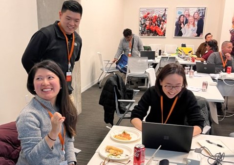
Christy Lam, Brandon Wong, and Joanne Lin participated in Seattle's Open Data Hackathon.
-
Household Travel Survey Explorer
-
Community Profiles
The community profiles app allows local jurisdictional planners to quickly access key Census and American Community Survey data from their area. Census data underlies much of the work we do as planners, but it can be inaccessible at times, and this app puts the important information at planner's fingertips. -
Summer Planning Academy Toolbox
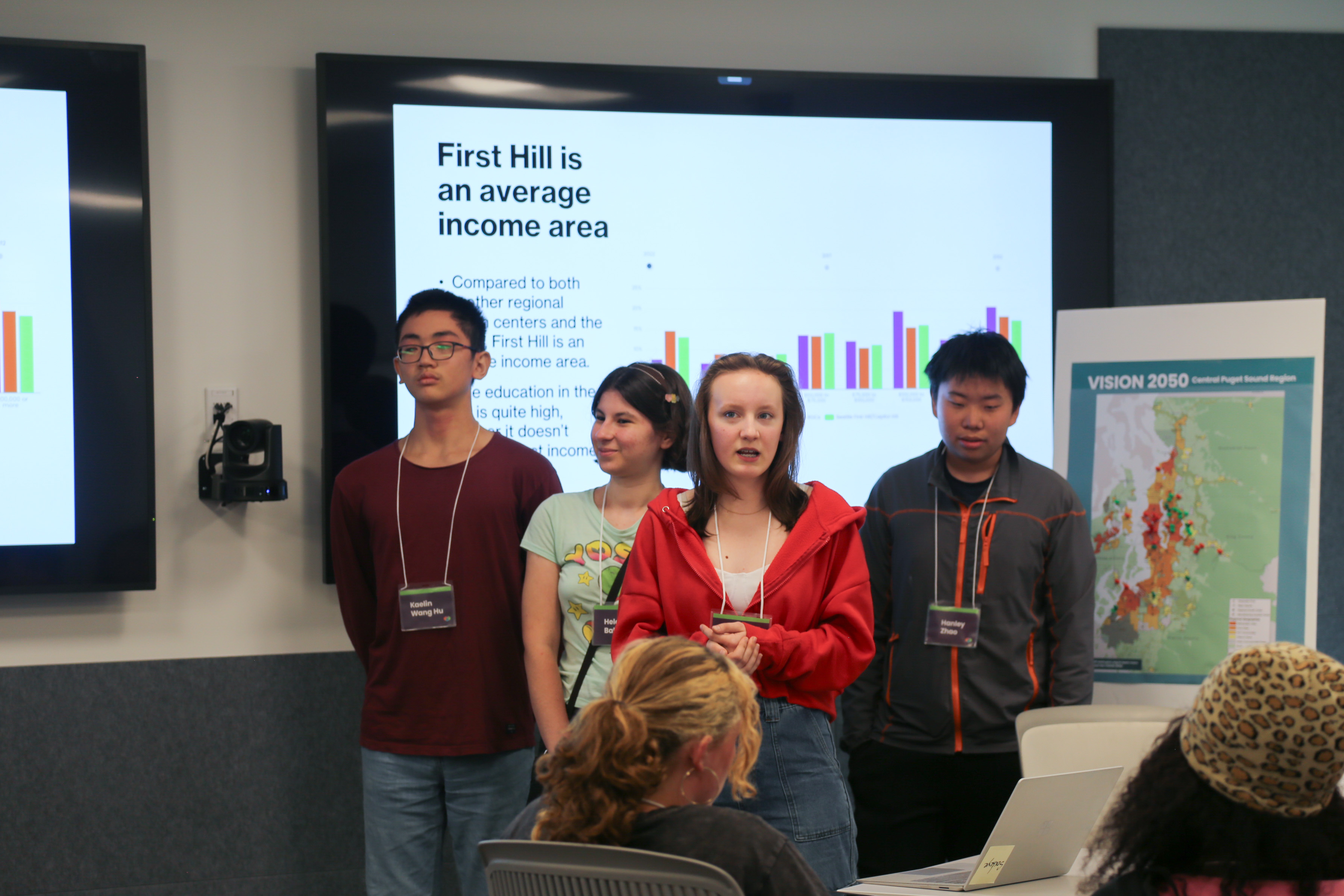
High school students used a shiny app we developed to learn about urban planning. You can see images they took from the app in the presentation behind the students.
-
Centers Monitoring Dashboard
PSRC's regional centers are areas of the region targeted to add new housing and job density. I like this dashboard because regional centers are a key aspect of PSRC's land use planning paradigm, and the dashboard allows us to track center performance. -
CTPP Hackathon App
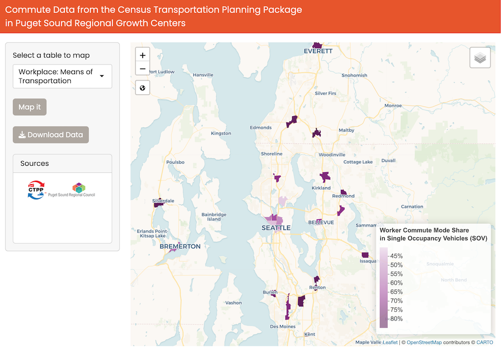
A screenshot of the app we developed to show Census Transportation Planning Package data in regional centers.
Hoping to inspire others!
The PSRC data team has reached to integrate programming, statistics, and urban planning to create more modern data products for about ten years now.
We’ve learned a ton along the way and we’d love to share. Here’s some hard-earned wisdom:
- Fully preprocessing data to feed to the app saves valuable user time as opposed to performing analytical calculations in the app
- 90% of app development is graphical formatting -getting things just right. When you get it just right, the response is exponentially higher than just conveying the raw information without nice visuals.
- Bringing an almost fully baked app at least visually (if not functionally) to people before we get feedback is critical- otherwise people don’t understand our vision.
Do you want to learn more? Or do you have something you’ve learned you’d like to share? Please reach out! email me: Suzanne Childress

